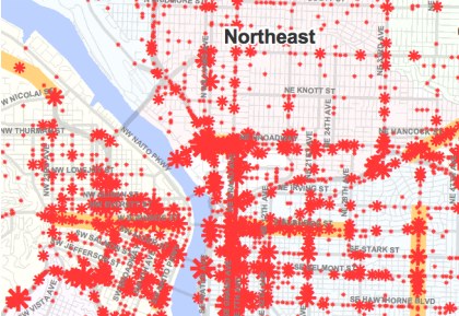
At the recent Transportation Safety Summit, the City of Portland Bureau of Transportation unveiled a new “High Crash Corridors” map. The map includes all crashes reported through the Department of Motor Vehicles between 1999 and 2008.
There were several things that struck me when I looked at this map (detail and link to full PDF version below the jump):

First, I thought the use of red stars was a graphic way to drive home the point that these crashes often result in people being hurt or killed (not sure whether PBOT made them red for that reason or not).
This map also reminded me how, unfortunately, DMV data does not reflect the full picture of traffic safety. Currently, the DMV only processes reports that involve a motor vehicle and where the amount of damage is valued at more than $1,500. Many crashes that involve bicycles are not captured by this data (the BTA is aware of this problem and has listed “crash reporting standards” as one of their possible legislative priorities in 2011).
And finally, this map served as a graphic reminder that, while Portland has an enviable record of engineering for safe streets and making traffic safety a priority — we still have a long ways to go. There are many unsafe intersections and traffic corridors in our City that need to be addressed.
Download PBOT’s High Crash Corridors 1999 ~ 2010 map here (2.3MB PDF).