

(Click to enlarge screenshot. Images from the MIT Media Lab You Are Here Project.)
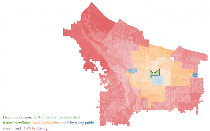
In Portland’s South Tabor neighborhood, the fastest way to reach 25 percent of the city’s land area is on a bicycle.
That’s one of the interesting estimates coming out of the latest web visualization by the MIT Media Lab’s You Are Here Project, which this spring also whipped up a three-year map of reported bike collisions by Portland location.
Their interactive online tool launched this month uses Google Maps travel time estimates to create color-coded maps of the city’s neighborhoods based on the fastest way to get from one neighborhood to the rest of the city: walking, biking, transit or car. And among the fun discoveries here is that the neighborhoods with the highest numbers for biking are up and down the middle of Portland’s east side.

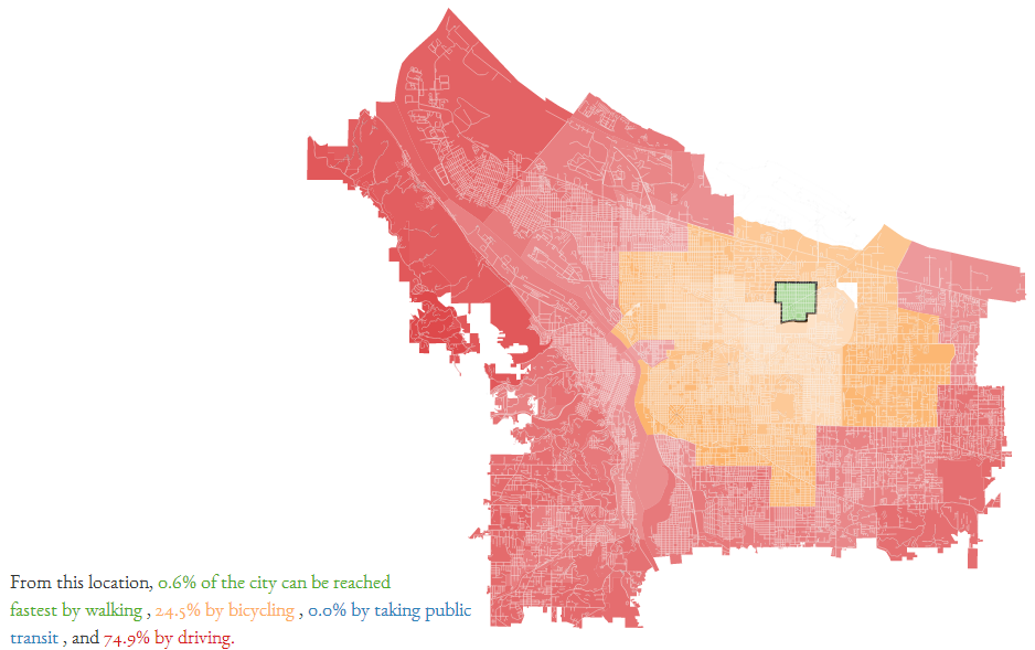
Biking also does well by this measure in closer-in east-side neighborhoods, and of course due to greater density in these areas it’s easy to argue that you can reach a higher share of your destinations fastest by bicycle.

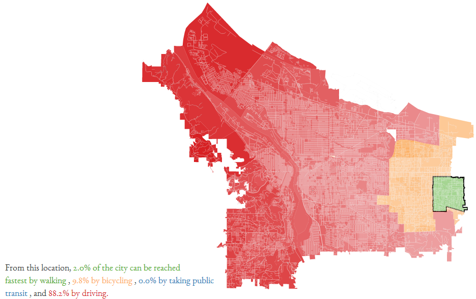
Head west, though, and it’s easy to see why Portlanders tend to start becoming more auto-oriented as they leave the connected street grid.

Advertisement


Some of the limitations here are that the map assumes that walking is always the fastest way to reach the neighborhood one starts in, and also that it ignores the possibility that anybody would ever want to visit Gresham.
Every tool like this (here’s a similar one from a few years back) is imperfect. But this one captures two truths nicely: first, that no matter where you live in the city, a bicycle is going to be the fastest way to get to a bunch of places; and second, that your choices of how to get around have a strong effect on how many parts of your city become part of your life.
“Our walking city is not our subway city is not our driving city,” the creators write in their description of the tool. Well put.
Update 9:55 am: On Twitter, Evan Landman of Jarrett Walker and Associates points out that the methodology here tends to hurt public transit because the calculations are based on the geographic centers of Census block groups … which are typically at least a few blocks away from public transit lines, whereas actual destinations are more likely to be on public transit lines. Good point!
Via OPB. The You Are Here project also created similar maps of Manhattan, Brooklyn, Philadelphia, San Francisco, Boulder, Salt Lake and other cities.