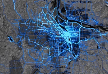
A map showing where users of Strava ride has become a web sensation in the past few days. And it’s easy to see why. The Strava Labs Global Heatmap is an amazing visual resource that shows the route of well over 77 million rides. We decided to take a closer look at the map to see what interesting nuggets it revealed about the Portland region.
But before we do that, it’s worth making a huge note of caution about how this map should be interpreted. Keep in mind that — despite many media outlets claiming it shows “where cyclists ride” — it actually only shows where people who use Strava ride. Because of that it captures only a tiny subset of a city’s overall riding activity. The vast majority of everyday riders don’t even know about Strava. It tends to only be used by more serious riders as a training and route-finding aid. That being said, it’s still a lot of data and it’s still pretty neat to ponder…
Bike shops and other places bike riders hang out
If you see a non-linear blob of route heat around a specific location, it’s probably either a bike shop, bike-centric fitness studio, or a place where lots of bike riders tend to get coffee or meet up before and after rides.
Here’s River City Bicycles…

The Stumptown Coffee on SW 3rd…

Upper Echelon Fitness on NW 17th…

Rapha and Western Bike Works…

BikeTiresDirect/Velotech HQ…

Unexpected hot spots
There are some places you wouldn’t expect to see any Strava activity. Like freeway bridges (unless there are people who log Bridge Pedal on Strava) and trails in Forest Park where bikes are prohibited. But there they are…
Marquam Bridge

Fremont Bridge

And Wildwood Trail in Forest Park (tsk! tsk!)

Popularity of Sandy Ridge MTB Trail system
We all know what a huge success the Sandy Ridge MTB trails have been, but to see them white hot on this Strava map really drives the point home:

Where we race
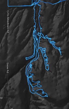
It’s fun to see where popular local races take place. From the criteriums, cyclocross, and MTB races at Portland International Raceway to the track racing at Alpenrose Dairy and even the off-road race out in the tiny Gorge town of Echo…
Echo MTB course…

PIR (note tracks on the infield from cyclocross and MTB short track)…

Portland’s lack of north-south bikeways
Even though these maps don’t represent a lot of bike commuter traffic, they still expose one of the Achilles heels of Portland’s bike network: A dearth of north-south routes on both sides of the river.
In downtown, SW Broadway is the only popular direct north-south route…

And on the central eastside, SE 7th is the only dominant north-south route (beside the Esplanade) between the river and 28th Avenue…

A preference for multi-use paths
From this map it appears that even serious riders, when given the option, will use a path instead of a bike lane alongside fast-moving auto traffic.
Check out Marine Drive…

And the use of the Waterfront Park path instead of Naito Parkway…

Inspiration for adventure
One of my personal favorite things about this map is how it inspires me to explore the region. I love seeing the little blue lines on dirt roads in the middle of nowhere. Those are the places I want to explore, and knowing that someone else has been there on a bike makes it a little less daunting to give it a try.
Making rides — and riders — count
Perhaps the coolest takeaway from this Strava data is what advocates and transportation agencies could do with this information. What if Strava and other ride data collecting companies collaborated with ODOT, PBOT, and Multnomah County, and so on? They could use it to estimate bike traffic counts, determine maintenance schedules, and use push notifications to warn road users about upcoming projects on specific roads. For instance, Multnomah County is currently re-working the crossing of NW Skyline and Cornelius Pass Road. That’s a very popular cycling spot, yet very few people know about the project. With their permission, users of Strava could potentially opt-in to advocacy alerts and make their voices heard. And if everyday commuters and city riders started tracking their trips, PBOT would have a valuable resource to use in planning and policymaking.
What other ways could we use this information? What stands out most to you when viewing the heat map?