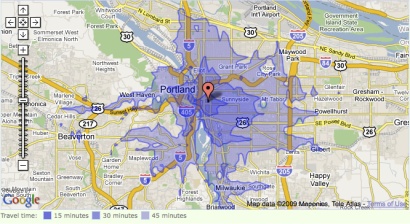
The folks at WalkScore have implemented a project similar to the joined forces with the Transit Shed tool that we told you about a few weeks ago.
What they came up with, the Transit Time Map, basically gives you a more flexible and multi-modal way to plan your travel throughout the day. The map is currently implemented, in a rough and occasionally slow form, in Seattle, Portland, and the San Francisco Bay area.

Here’s how the tool’s creators describe it:
A transit time map shows how far you can travel on public transit from a given location in a certain amount of time.
This map is a baby step towards helping you find a walkable, transit-friendly place to live so that you can ditch the zero (your car) and get with the hero (your new walkable condo near a light rail stop).
Did you know the average American spends over $8,000 per year on their car1? Did you know this is the equivalent of having a $135,000 mortgage?
WalkScore was inspired by a blog post at the Sightline Institute and is the product of a company called Front Seat. Their tag line is “Software for Civic Life:”
“Civic software connects people to the places we live, the resources we consume, and the communities we participate in.”
Front Seat is actively soliciting ideas for future projects. These folks will be worth watching as we navigate the transition from old media to new, and from old ideas about mobility to new ones about proximity.

