Portland has been at the cutting edge of traffic design for many years. In America, with our stringent, car-centric traffic design guidelines, that means having engineers who are not afraid to push the boundaries of the status quo.
The most recent example of this are Portland’s colored bike boxes. We weren’t the first city to do them, but we were the first to launch several of them at once on busy intersections in the urban core.
Before laying them down, PDOT sent an official “Request to Experiment” to the Federal Highway Administration. It’s not a required step, but an official nod from the FHWA would help PDOT breathe a little easier, and more importantly, would open the door to make colored bike boxes a standard treatment that could then be adopted more easily in other cities.
Back in July, we reported that the FHWA responded to PDOT by requiring them to test some of the bike boxes without the color.
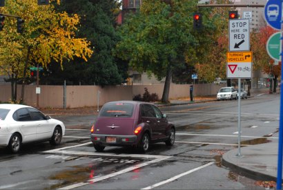
PDOT has complied with this request and has installed several bike boxes without the green, thermoplastic paint the initial ones had. One of the non-colored locations is at Broadway and Hoyt in Northwest Portland. Here’s how it looks.

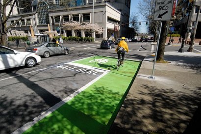
For comparison, here’s how a colored bike box works (this one is at Madison and Third):

To me, it seems clear that the color adds an important visual cue and that it is an imperative measure for increasing the safety and effectiveness of bike boxes. I hope the FHWA agrees.
(Note: PDOT is also working with Portland State University’s Initiative for Bicycle and Pedestrian Innovation on a bike box research study funded by the Oregon Transportation Research and Education Consortium. More info on that study here.)


