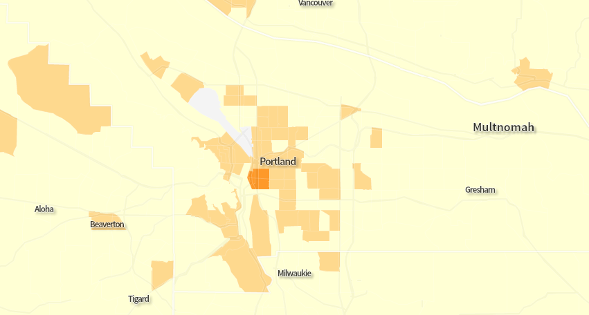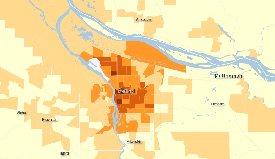
(Image captured from Census Explorer’s new Commute Edition)
Certain less geeky news outlets we might mention are reporting today on a report about biking and walking to work (PDF), just out from the Census Bureau.
We haven’t jumped on the news, since we covered this data when it first became publicly available last fall. (We love you, though, OPB.) But one thing that is new on the Census site is a very nice interactive map that quickly plots 22 years of commuting data to the neighborhood level.
Until this site went online, this tract-level data had been trapped inside endless databases and the American Factfinder’s ancient mapping software. This web-friendly presentation (only nine years after the release of Google Maps!) is far superior — and it’s especially easy to flip to the 1990 and 2000 Census data to watch changes over time.
Above is a map of bike commute rates for various tracts in the Portland area as of 2012. In the darkest sections, at least 20 percent of the working population gets to work primarily by bicycle. The region’s bikingest tract is the west half of Ladd’s Addition in Southeast Portland and the area just to its west, where an estimated 25.9 percent of workers commuted by bike as of 2012.
If that’s not impressive enough for you, here’s a similar snapshot, using the same scale, of where things stood in 1990:
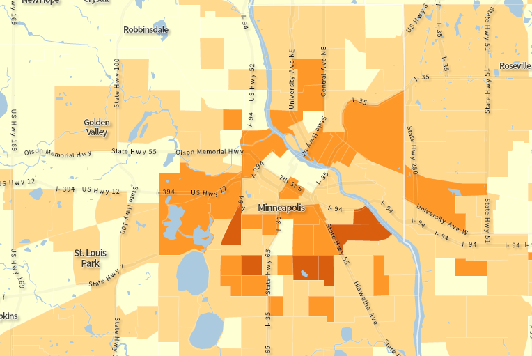
And (just because it’s been on people’s minds lately) here’s a map of the 2012 bike-commute rates in Minneapolis:
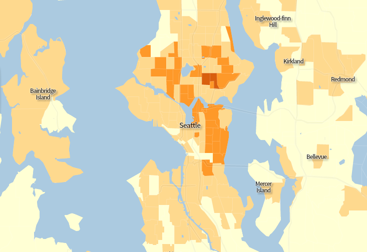
And Seattle:
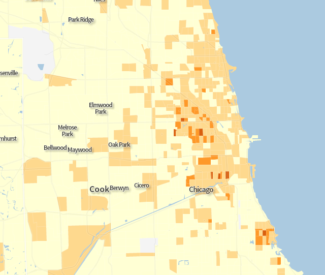
Chicago:
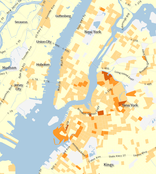
New York City:
Careful observers will notice that in none of the above cities do any tracts exceed 15 percent bicycle usage, let alone 20.
