
It’s always interesting to look back and see how bicycling has grown in Portland over the decades.
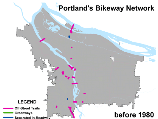
Back in October 2005 I took some slides from a presentation by PBOT Bicycle Coordinator Roger Geller and put together a GIF showing the development of Portland’s bicycle infrastructure each year from 1980 to 2012 and beyond. That one’s worth another look:
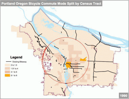
The GIF above is neat, but it only shows infrastructure. Now I’ve put together a more up-to-date animation that combines infrastructure with bike mode share. In the 2012 Bicycle Count Report released by PBOT this morning, Geller included several graphics of the bikeway network overlayed with U.S. Census tract data based around a four-mile radius of the Burnside Bridge. When those graphics are put together into a GIF, you see a more compelling visual picture of how cycling has grown in Portland between 1990 and 2011:

GIF by BikePortland using graphics created by PBOT
While it’s fun and reassuring to see our progress over time — in both system development and ridership numbers — we are growing at a slower rate. There are many people in Portland still waiting for us to complete our network of bike-friendly streets. And until we do, we won’t see a huge jump in ridership. Stay tuned.
UPDATE: If that GIF goes too fast to fully comprehend each graphic, I’ve shared them below for your viewing pleasure (click to enlarge):


