After many years of toying with the idea, I’m finally moving forward with creating a BikePortland jersey. Our friends at Retro Image Apparel/Micro Beer Jerseys are putting it together. I’ll have full details once the samples come back; but for now, I’d love to hear your feedback on the design. It’s pretty far along already and we’re looking to send the final design off this week. I’m not looking for major feedback or new design ideas at this point, just minor tweaks and a general sense for what you think about it.
Check out the design after the jump…
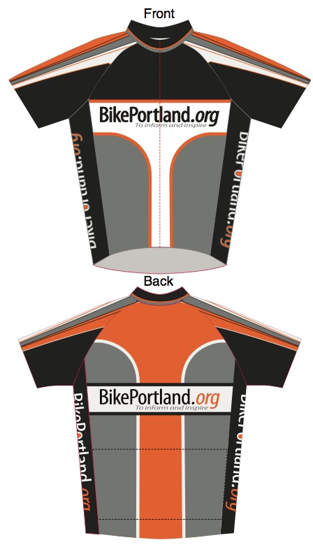
If all goes according to plan, we’ll start taking pre-orders in a few weeks and then have the jerseys out in the wild by end of November, start of December. Thanks and I hope you like it!
 worse than you think")


Very nice. I’m not usually a logo person but I’d consider this in support of our friendly-neighborhood biking “newspaper”.
How about long sleeves for cross season?
good idea. But this is just a first foray. If it goes OK, maybe I’ll do other styles/designs in the future.
Will this be cut like a road jersey? I’d prefer a more relaxed fit/cut. I’m guessing most of your readers are not roadies but daily bikers who may not want appreciate a roadie jersey. Maybe a cut like this one from Sugoi:
http://www.sugoi.com/usa/bike/men/jerseys/neo-jersey-32.html
Thanks!
Style is highly personal, but I’m sold. Consider one Med Mens jersey pre-ordered. Jonathan, a question: will these be “club” or “race” fit? I got a Lucky Lab jersey a while back that is “club” fit, and it fits terribly. Too baggy in the mid section (and I ain’t too skinny) and too short for leaned over the bar positioning.
Glad you like it! As far as I know, Retro is going with their standard fit, which is more of a club fit that full-on racer. Have your tried one of their jerseys yet? I wear an XL and it feels good. Haven’t put miles/racing in on it yet, but hope to have the sample on my back in a few weeks and I will report back.
Maybe it’s just me, but the first one looks like a monster wedgie.
it’s just you… I wear boxers so the wedgie thing didn’t come to mind until you mentioned it…
but now that you mention it, yeah, it totally looks like a wedgie…
Nice design…….I am not into orange very much as a color though….
Yes! Please take my money!
It will be cute. You and BTA will all have matching schemes. . . . .
Bit seriously though, I actually like it! I would wear it in a sm or xs! And for cross, I still need a short sleeve – even on cold days I end up regretting or ripping off the arm warmers.
Can you brighten it up a bit? How about some bright biker green on the shoulders or arm area?
Will it only be available in mens sizes?
There will be women’s sizes too.
Nice design Jonathan!
Can you add a few “comments,” maybe running down the center of the back?
+1
Hmmm. Interesting. But how to represent them graphically?
I’d try to bring the white element on the front more in harmony with the orange one on the back. The proportions of the orange element look better and it looks more dynamic. With the orange, the vertical lines enter the radius and then terminate before they become purely horizontal. With the white, the lines become totally horizontal and they lose their grace.
On the front I’d add a bit of white space above “BikePortland.” I’d also add white space both above and below “BikePortland” on the back, it looks a bit cramped.
It also looks like the “to inform and inspire” has been compressed vertically. That doesn’t look so good and it alters the type of your established logo.
Well said. All good advice!
Black for a jersey? Visibility is key. Design is great; how about a (sky to slightly darker) Blue where the black is, Gold where the orange is, white stays put – maybe grey stays too.
I think the colors are set to the BikePortland brand (e.g. web site) colors…
Some ideas to consider:
I realize that the jersey is using the site’s color schema, but also consider that we live in Portland, and Portland has our own flag’s colors of green, yellow and blue:
http://en.wikipedia.org/wiki/File:Flag_of_Portland,_Oregon.svg
Green is also a powerful color right now, with the obvious ‘green cycling’ message, but the Portland Timbers also have shades of green (and neon) put to great effect.
Speaking of neon, conspicuity is also an idea. Perhaps some florescence as well?
Finally, there was a great local jersey design, and I still haven’t seen better, from Cyclo Sportif – what ever happened to them?
http://www.cyclo-sportif.com/
http://cyclosportif.files.wordpress.com/2007/12/library-1505.jpg
http://www.cyclo-sportif.com/userfiles/Image/Race_1_Alpenrose_2%281%29.jpg
http://www.cyclo-sportif.com/userfiles/Image/CycloSportif_-_Charlie_Warner_on_the_Track%281%29.jpg
Nice – I am interested. will there be any reflective qualities, e.g., reflective trim/panels?
While rapidly scrolling down the first thing I thought was “did I just see a pair of tighty whiteys?!”, but it’s the front of the jersey. Probably just my perverted mind!
nicely done!
I will echo an earlier comment that I don’t normally wear any clothing with a logo on it. For BikPortland I would totally make an exception to that rule though. This sight is one of many reasons to be proud of where I live.
Hi Jonathan, I think the design is fine, but I’d like to see it in colors that don’t occur in nature such as neon orange, green and/or yellow. Those are colors that perhaps motorists would see better and make it a little safer when sharing the road.
why is the O not filled in like on the web site logo?
also, I would have expected a bicycle on there somewhere… maybe a sharrow? (:
otherwise I think it looks pretty good… I generally don’t wear jerseys, but I’d add this to the three bike-specific tops that I own…
What, no scorpion?!
When you are ready for the custom thermal CX suit (or bibs, jackets, speedsuits, raero rain jackets, tri stuff, etc.) let me know.
BP branded unitard maybe?
…and, of course, I like it.
I’m not a graphic design artist, but I tend to agree with the visibility comments. That would conflict with BPs site colors, though, so maybe making the orange a little brighter and having the grey as a reflective material?
I’m in for at least two any which way!
I wear a primarily black kit with hits of orange and white sidepanels. I have not noticed any difference with my “visibility” vs my other kits, which all have black bibs which and a red jersey, a blue jersey, and a red/white jersey.
That being said, I do use lights when commuting in the morning and evening (and during the winter when it’s overcast or might rain), and don’t wear my kit out after dark if I’m going to the bar or someplace like that, I’ll ride in my street clothes with lights.
Like the design, Jonathan. I’ll take a large, and a small one for Chris! How about an ad-hoc bikeportland cross team?
Excellent! Count me in on the pre-order! Patrick’s comment above about wedgie is consistent of my impression….I was thinking the white area had bikini feel too it.
Yawn! With all of the design talent available in Portland I can’t help but think that it could be so much better.
There is lots of design talent in Portland. The current design looks early 90’s.
Post a job ad for a jersey design intern. In 30 days you would have a jersey that would sell even if people did not know about this blog. And the designer could have his/her name somewhere easy on the eyes.
I’d buy one if it was wool or looked more like the tweed ride. ya know mostly a solid darker color or very light pattern of tweed. Something like any of these thumbnails in the URL below, but not the pink one.
http://tinyurl.com/bikepdxshirtdesign23
Agree with Barney and Joe AND I have long believed that it is a mistake to continue to accrue brand equity without a really compelling identity. I love orange and I love BikePortland but I would not wear this.
I like it, but think the front would look better if it matched the back with orange outlined in white instead of the way it is reversed with the horizontal stop. I realize there will many differing opinions and it is not possible to meet everyone’s desires. I will be ordering one when they are available.
Duck fans would never wear Beaver colors, just saying.