“One of the key themes of the campaign is looking for other road users and being aware.”
— BTA education coordinator Stephanie Noll
“We need to see Eye to Eye—a lot is riding on it.”
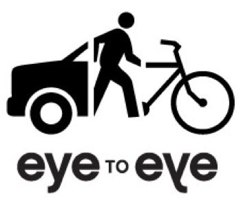
That’s the theme of a new, statewide safety campaign being organized by the Bicycle Transportation Alliance (BTA). Last week, the BTA and their partners agreed on a logo (see it below) that will play an important role in this fledgling road user safety awareness effort.
Here’s the logo. It was designed by Grapheon, a Portland-based design company and long-time supporter/partner of the BTA:
officially launched on August 13th.
BTA staffer Stephanie Noll is the point person for the Eye to Eye campaign. She says they hope the logo speaks to all road users; “The figure in the middle, while representing the pedestrian, also represents the individual person walking, biking, driving, skating, and so on.”
Noll adds that the reverse text in the logo (reminiscent of the view from a rear-view mirror) is meant to reinforce one of the campaign’s main themes — making eye contact. “One of the key themes of the campaign,” she said via telephone this morning, “is looking for other road users and being aware.”
The BTA plans to make a soft launch of the campaign at the finish line of the upcoming Bridge Pedal ride and the official launch is slated for a public event and press conference on Wednesday, August 13th.
Joining the BTA in this effort are a host of community partners including TriMet (who has donated ad space on their buses), the City of Portland Office of Transportation, Portland’s Water Bureau, the Greater Eugene Area Riders (GEARS), and the cities of Eugene and Springfield (the mayors of those two cities will attend a press conference in Eugene also scheduled for August 13th).


Who designed the logo?
aack! i meant to add that. Grapheon. I\’ve edited the story to include that fact. thanks Matt.
The one thing that consistently prevents me from making eye contact with drivers (which I agree, is very important for safety) is when they are talking on a cell phone. That\’s true whether they are driving a bike or a car.
I like it! It\’s cute, simple, and promotes the idea that we\’re all out there together, trying to share & get along.
Whee!
Is that bike a brakeless fixie???
Just kidding.
wow, that is an awkward mess of a logo. Smacks of pro bono work. I especially like the way there is only one person, the way cars and bikes are going different directions, and the lack of an actual eye, even though it is in the name twice . . . Art Institute project?
I don\’t get it
or maybe that should be
eye don\’t get it
I am sorry, but I have one comment about the logo.
Lackluster.
Ethan,
Excellent critique, dead-on. There doesn\’t seem to be any way to tell which way the car is going, but then the whole thing is unclear about any intent except some vague association between the elements. Maybe Ms. Noll and her working group did not have benefit of any professional artists as jury members?
It looks more like something weakly urging motorists to get out of their cars and ride bike.
As an east coast transplant, I can tell you that eye to eye contact with a cage is no assurance that they will respect your space.
#3, FredLF, one of my favorite types of motorists to make eye contact with are the cellers. How to Annoy Celling Motorists, WITHOUT Really Trying:
1) Roll up to the offending motorists stopped at the red light;
2) Calmly turn your head,and look DIRECTLY into the eyeballs;
3) Stick tongue out and make hand motions related to hanging up. Continue until light turns green or motorist hangs up.
Paul…you forgot #4:
Car driver gets pissed and tries to run you over. imo: myob
Ethan #6 –
Why does there need to be more than one person? Each piece \”represents\” a different mode of transportation.
And how do you know the car & bike are going in different directions? That could easily be the back of a car.
And putting an actual eye in it seems a bit obvious to me. Like when Java came out with their logo and it was… a coffee cup. Practically straight out of ClipArt. How much did they pay someone to think of that? Besides, if it just said \”Eye to Eye\” and there was a picture of an eye, no one would know what it was about…
Anywise, I still think it\’s cute!
Jessy, I merely was pointing out how nothing ties together or means anything.
I will also add (since I have been ponding it on and off all morning) that the scale of the two vehicles is completely out of whack given the massive size/weight difference between the two vehicles. But I stand by the general notion that this is a travesty on many levels.
Are tinted driver-side windows legal ?
Everyday I encounter this problem.
pretty sure it\’s illegal in Oregon to have either the driver\’s or passenger\’s front side windows tinted
While I might have a point of critique or two for the design- I do like how the car, pedestrian & cyclist seem to be all considered as \”one\”.
My town recently repainted our our street lines but has no plans (I called Public Works to ask) to repaint the outside bike lane stripe. I called Public Works to let them know that while funding is short, the bike lane paint should be considered with the same priority as the road paint. It shouldn\’t be treated as a \”luxury\” if we, I quote, \”have leftover paint.\”
I think this logo speaks to making cycling and walking as \”legitimate\” or as high of a \”priority\” as driving.
Now, I don\’t know if that\’s the intent of their message- but that\’s what I got out of it and I think it\’s successful in that regard.
Bunch of dim art critics. Who cares which way the car is going? I got the point right away and that is whats important. I think its quite well done, I like it. I dought if any of you could come up with anything as good. I hope that they didn\’t pay some crazy amount for it though
Fantastic! Rock on Stephanie, your hard work with the BTA is much appreciated.
Ashley, hard work at the BTA doesn\’t make this an effective logo. I thought the automatic back-slapping machine left with Evan.
Jimbo, rest assured they probably did not pay a dime for it, which is probably the issue.
. . . and jimbo, I disagree with your assertion that nobody could do a better job, I spent 30 minutes on it and liked the results much better (still a work-in-progress):
http://flickr.com/photos/ethanjewett/2734809592/
It reminds me of a cool 80\’s TV show about filthy rich, middle aged, private detective husband and wife teamdriving around in Mercedes convertibles.
By the way, My name is Max.
Cuz when they met… it was murder.
[roll theme music]
I\’m not sure what I think of it. Kind of reminds me of the Liger game my boys are always playing, \”If you combine an elephant, a giraffe and an antelope…. Gir-Ele-Lope Then they try to draw the picture. I\’m gonna have them do an auto-ped-ike and see how close it comes to the logo.
Not hating on the logo, it\’s just a little muddled and fused for me, on first blush.
Good effort Ethan. Keep at it. Its a little too busy though, too much stuff on it. People only look at a sign for about a tenth of a second. Its a tough assignment.
Paul #12
What do you do when you come up on a biker talking on a phone?
or God forbid a pedestrian??
jimbo, I totally agree that mine is too busy. I like logos to be able to be 1/2\” x 1/2\” and be readable, and that obviously is not met.
One interesting thing that I ran into (that Grapheon obviously did as well) is that motor vehicles, by virtue of their size, take of as much real estate graphically as they do in the real word. The logo above deals with this by radically changing the relative scales of the 3 elements, and by cropping out 2/3 of the car and 1/2 of the bike (and the feet of the ped so it could hypothetically be a rollerblader) . . . My route was to pick a much smaller auto (smart car). None of these are perfect solutions, but I think it is interesting because it mirrors the infrastructure demands of cars vs other modes of transport (i.e. parking, highways, lane widths etc).
Another thing that came up for me with the Smart Car was that it represented a better \”Portland-centric\” view of an ideal car than some generic sedan does. This runs the risk of making drivers of larger vehicles feel less like the logo represents them, but I liked the idea that the mark would also contain an idealized vision of car use.